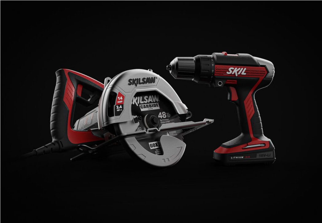
In a crowded marketplace, products have only seconds to catch someone’s eye. One of the most effective ways to stand out is through color. We’ve seen time and again how a well-chosen bold hue can transform a product from ordinary to iconic. Bold colors in product design don’t just add visual interest – they tell a story, evoke emotion, and make a lasting impression on consumers.
At CHOI Design Group, we understand the strategic power of color. As an award-winning product design firm, we employ design thinking to ensure every design choice serves a purpose – and color is no exception. Good design is discovered in the process, and exploring vibrant color options is part of that journey. In this article, we’ll share our perspective on the “Color Pop” strategy and how using bold colors in product design can elevate your product, supported by examples from consumer and commercial markets.
Bold Colors in Product Design: Why They Matter
Color is more than just a styling detail; it’s a powerful communication tool. Different hues carry distinct psychological impacts. For instance, red is often associated with passion and energy, while blue conveys trust and reliability. When applied thoughtfully, bold colors tap into these emotions to influence how users perceive a product at first glance. For example, a splash of energetic orange on a power tool can suggest high performance, and a refreshing green on a kitchen appliance can imply eco-friendliness or health.

Beyond emotion, bold colors create instant visual impact. In a sea of gray and black gadgets, a pop of color immediately draws the eye. High-contrast palettes help highlight key product features or user touchpoints. Imagine a modern coffee maker with a single neon-accented button – your attention naturally gravitates to that button. By directing focus, color becomes a functional part of the design, guiding users and even improving intuitive use.
Using Bold Colors to Strengthen Brand Identity
Bold colors are also a cornerstone of memorable brand identity. Consistently using a signature color on products, packaging, and marketing builds strong associations in customers’ minds. Think of the brands you recognize from across a store; often it’s their distinct color scheme that tips you off before you even see the logo. In fact, research indicates that color can increase brand recognition by up to 80%. That means the bold hue you choose today could become synonymous with your brand’s story.

We often help clients select palettes that not only look striking but also align with their brand values and target market. A commercial tool designed for tough job sites might leverage a bold yellow or red for both visibility and alignment with industry norms. Power tool brands, for example, often have trademark color schemes for this reason. On the other hand, a consumer electronics product aimed at design-savvy shoppers might use a vibrant, unexpected hue to signal creativity and modernity. By weaving signature colors into a product line, companies create a visual thread that ties their offerings together and clearly differentiates them from competitors.
Bold Color in Action: Examples Across Industries
Bold color strategies can be applied in virtually every product category. Here are just a few examples of how vibrant hues make a difference across industries:
- Home Appliances: In the kitchen and laundry room, a pop of color can turn an appliance into a statement piece. Consider a retro-style refrigerator in bright red or a sleek stand mixer in electric blue. These products break away from the usual neutral palette, giving consumers a chance to express personality and making the brand instantly recognizable.
- Consumer Electronics: Personal tech doesn’t have to come only in black, white, or gray. From smartphones available in eye-catching colors to headphones with neon accents, bold choices appeal to users’ individuality. A limited-edition gadget in a vivid colorway often becomes a conversation piece, creating buzz and driving demand because it stands out from the standard offerings.
- Power Tools & Equipment: Bold colors aren’t just about style – in tools and industrial equipment, they serve a functional purpose. The bright orange or yellow of a power drill, for example, isn’t just branding; it ensures high visibility on a job site and enhances safety. We’ve designed rugged commercial gear with bold color panels to not only reflect a company’s brand but also to help users quickly identify controls or safety features. It’s proof that aesthetics and practicality can go hand in hand.
- Furniture & Decor: In furniture design, a strategic use of color can transform an environment. Think of a modern chair upholstered in a bold yellow fabric or a desk lamp finished in a vibrant teal. In commercial spaces like offices or hotels, these color pops create focal points and convey a contemporary, welcoming vibe. In home décor, offering a classic piece (like a lounge chair or coffee table) in a bold color option allows customers to add character and a personal touch to their living spaces.
These examples scratch the surface, but they illustrate a key idea: when applied with intent, bold colors make products more memorable and engaging in both consumer and commercial contexts.
Our Design Thinking Approach to Color
Every project and market is unique, so we take a design thinking approach to our color strategy at every step. This human-centered, iterative process ensures our color decisions are not just bold for boldness’ sake, but rooted in real user insights, cultural context, and sound brand strategy. We collaborate closely with our clients to understand the target audience and the environments where their product will live. Are we designing a tool that needs to stand out in a busy workshop, or a piece of consumer tech that should blend elegantly into a home? Such insights inform our palette choices from the very start.
True to our belief that good design is discovered in the process, we explore a wide range of color options early in development – from safe choices to daring alternatives – using sketches, digital renderings, and physical prototypes. It’s not unusual for us to create multiple style variants of a concept, each with a different color scheme, and then gather feedback on each direction. This exploratory phase is often where the magic happens and the best ideas emerge. By iterating on color in tandem with form and function, we ensure that our bold color choices aren’t just visually impactful but also enhance the product’s usability and appeal.
We also consider how color interacts with materials and finishes. A glossy, bold yellow on a curved plastic surface can evoke a very different feel than a matte yellow on a textured metal one. Our design thinking process involves refining these details – tweaking shades, material samples, and finish types – until we strike the perfect balance. The result is a color choice (or palette) that looks stunning, meets practical requirements like manufacturability and durability, and elevates the overall design.
Making a Lasting (Colorful) Impression
When used strategically, bold colors can elevate a product from simply functional to truly unforgettable. They grab attention, reinforce brand values, and can even guide user interaction. But a successful “color pop” strategy doesn’t happen by accident – it comes from thoughtful research, creativity, and plenty of iterative refinement. At CHOI Design Group, we thrive on that challenge. Our team’s collaborative process ensures every element of the design – including color – is intentionally crafted to help your product succeed in the market.
If you’re looking to infuse your next product with a bold new energy, let’s talk. Work With Us to create products that stand out and excel. We have decades of experience helping brands use design to gain a competitive edge, and color is often the secret ingredient.
Ready to make a bold statement with your product line? Request a Quote or Get In Touch with our team today – we’ll partner with you to transform your vision into a vibrant reality.
