Color is more than just a visual element; it’s a powerful tool that significantly impacts how consumers perceive and engage with products. When wielded skillfully, bold color palettes can transform ordinary objects into captivating designs that leave a lasting impression.
The Psychology of Color in Product Design
Understanding the psychology of color is fundamental to effective product design. Different hues evoke distinct emotions and associations. For instance, red is often linked to passion and energy, while blue conveys trust and reliability. By carefully selecting colors that align with the desired product image, we create designs that resonate deeply with consumers.
In our collaboration with Chicago Flyhouse on a rigging control console for performance venues and theaters, we carefully considered the psychological impact of color. We chose hues that evoke creativity and excitement, ensuring that our design not only functions well but also enhances the overall atmosphere of the theater.
Creating Visual Impact with Bold Colors
Bold colors have an undeniable ability to grab attention and make a product stand out. However, effective use of color is about more than just bright hues; it involves creating a harmonious and impactful palette. High-contrast combinations can draw the eye to specific features, while complementary colors provide balance and cohesion.
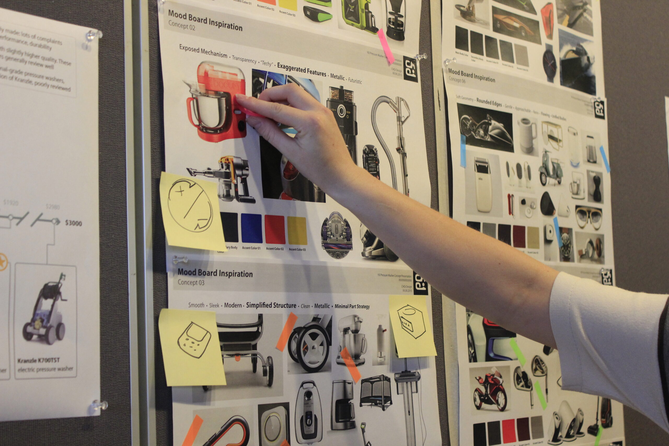
For instance, in our project with Yili on their electric power washers, we strategically employed bold color choices to help the product stand out in a competitive market. By understanding user needs and market trends, we highlighted key features through our color selections, resulting in a visually striking design that captures attention.
Strengthening Brand Identity Through Color
A strong brand identity relies on consistency and memorability, and bold colors are a powerful tool in achieving this. By incorporating a distinctive color palette across all marketing materials, packaging, and product design, we create strong visual associations in consumers’ minds. This consistency reinforces brand recognition and helps differentiate products from competitors.
Our approach to product development emphasizes user experience and interface design. In every project, we consider how our color choices contribute to brand identity and user interaction, ensuring a cohesive visual language across both digital and physical products.
Navigating Cultural and Contextual Factors
Color symbolism varies widely across cultures, which can significantly influence design choices. What is considered auspicious in one region might be perceived as unlucky in another. Therefore, it’s essential for designers to research color meanings in different cultural contexts to avoid unintended consequences.
As a design firm with experience across various industries, we take these cultural and contextual factors into account in our color decisions. Our work in medical, consumer, and commercial sectors necessitates a nuanced understanding of how color perceptions can vary, allowing us to create designs that resonate with diverse audiences.
Testing and Refining Color Palettes
Selecting the perfect color palette is often an iterative process. We gather valuable insights through consumer surveys, focus groups, and A/B testing of different color options. Feedback from target audiences helps us refine our color choices, ensuring that the final palette resonates with the desired consumer perception.
Our emphasis on user research and a deep understanding of user needs means we actively incorporate feedback into our color selection process. This approach ensures that our bold color choices not only look appealing but also enhance the overall user experience of the product.
Conclusion
Bold colors, when used strategically, can be a game-changer in product design. By understanding color psychology, creating visually striking combinations, and considering cultural nuances, we can develop products that not only look great but also connect with consumers on a deeper level. A well-executed color palette can elevate a product from ordinary to extraordinary, leaving a lasting impression in the marketplace.
Our expertise in product design and development, combined with our focus on user experience and innovation, positions us to create impactful color palettes that enhance product appeal and functionality. Our diverse portfolio showcases the versatility and importance of thoughtful color application in product design, making us your ideal partner for unlocking the full potential of color in your next project.
FAQs
Color plays a crucial role in product design as it influences consumer perception, evokes emotions, and enhances brand identity. A well-chosen color palette can make a product more appealing, memorable, and effective in communicating its intended message.
Different colors are associated with various emotions and meanings. For example, red can evoke feelings of excitement and urgency, while blue is often linked to trust and calmness. Understanding these associations helps designers select colors that align with the desired emotional response for their products.
Designers should consider several factors, including color psychology, cultural meanings, target audience, and the product’s intended use. It’s essential to create a harmonious palette that not only grabs attention but also resonates with consumers on a deeper level.
Designers can test the effectiveness of their color choices through methods such as consumer surveys, focus groups, and A/B testing. Gathering feedback from target audiences helps refine color selections and ensures that the final palette aligns with consumer preferences.
Successful examples of bold color usage include the electric power washers designed for Yili, where vibrant colors were used to differentiate the product in a competitive market. Similarly, the rigging control console developed for Chicago Flyhouse utilized color strategically to enhance the user experience in theatrical settings. These examples demonstrate how bold palettes can effectively capture attention and convey brand identity.